Graph Features
Statistics101
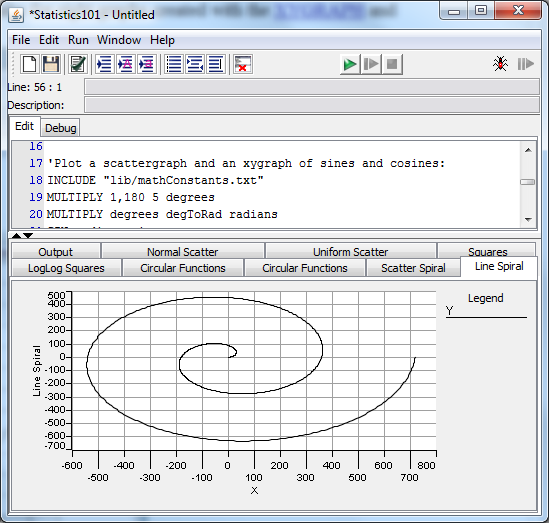
displays graphs in tabs in its Output Window. Here is an image of
Statistics101
showing the tabs for eight graphs created with the XYGRAPH
and SCATTERGRAPH
commands. Only one graph shows at a time, of course.
The
main feature of the Output Window when it is showing one or more
graphs is the set of tabs at the top that are used for selecting
which graph to view. The first tab is always labeled "Output"
and is the main Output Window that displays the textual output of
your Statistics101
programs. Each of the other tabs is created by a single XYGRAPH
or SCATTERGRAPH
or HISTOGRAM
command and has a name that you can set in the command.
You
can cycle through the tabs using the right or left arrow keys on your
keyboard.
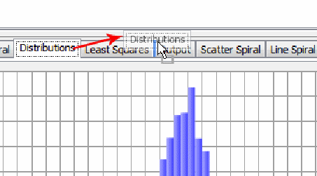
If
there are too many tabs to fit within the width of the window, then
the tabs are "wrapped" (by default) into multiple rows as
shown above. If you would prefer them to display as one row with a
scroll handle, then you can open the Preferences
dialog
using the Edit>Preferences... menu, go to the "Graphs"
tab and check the "Scroll graph tabs" check box, then click
OK.
You
can left-click on any tab and, holding the button down, drag the tab
to a new position in the row of tabs until the colored highlight
appears indicating a legal drop point, then release the button. The
tab will take up the new position. This next figure shows how the
dragged tab appears just before it is dropped into a new position.
You
can access a popup menu on any tab as shown in this figure:
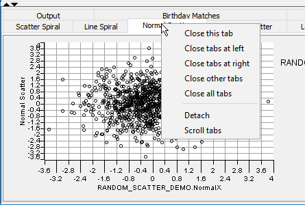
The
popup menu will let you close the selected tab (except the Output
Window), or close all tabs to its left, or all tabs to its right, or
all other tabs, or all tabs. The tab labeled "Output", which contains
the original textual Output Window, will remain as long as there is at
least one graph tab present. When the last graphical window tab is
removed, the output tab will disappear, but the Output Window will
remain, filling the output panel.
The
"Detach" menu item causes the selected tab to be removed and for its
graph to be displayed in a separate resizable floating window. If you
close the floating window by clicking its close icon then the floating
window will disappear and the graph will be returned to a tab in the
output window.
The
last menu item is labeled "Scroll tabs" or "Wrap tabs", depending on
the current state of the tab layout options. The effect of this menu is
only seen when there are too many tabs to fit within the width of the
main window. When the "Wrap" option is in force, the excess tabs are
shown in rows, with all tabs visible. When the "Scroll" option is in
force, only one row of tabs is shown and the excess are hidden
off-screen. In this case (scroll), in order to see the hidden tabs you
need to click on the scroll bar that appears.
Each
tab after the Output tab is associated with a single graph. The main
features of a graph are its horizontal and vertical axes, its legend,
and of course the graph itself. Each axis has a label and a numerical
scale. The axes titles are set by the graphical command to names from
the argument list or to names you provide in the command. The scale
is determined automatically by the command. See each command for
specifics.
The
legend is built automatically by the command and shows which color or
line type is associated with each "Y" vector.
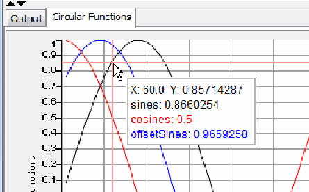
As
you move the mouse pointer over the graph you will notice that a
crosshair and an annotation will follow the mouse. The annotation's
first line gives the X and Y values at the mouse pointer. The other
lines list the Y values associated with that X value for each of the
curves in the graph. Here is an example.
The
last main feature of the graph is the popup menu that appears over
the graph when you trigger it by right-clicking or by whatever serves
as the popup trigger in your operating system. It allows you to
control and change some of the graph's characteristics. Here's what
the menu looks like:
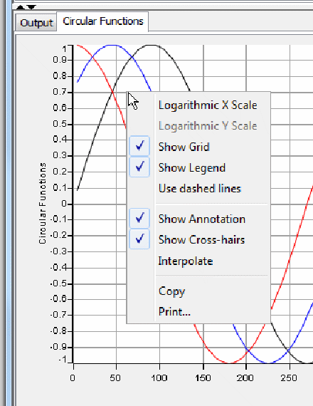
Here
is the functionality of each menu item:
Logarithmic
X Scale:
This is only enabled when all the X-values are greater than zero.
When this item is selected, the X-scale will be logarithmic. When it
is not selected, the X-scale will be linear.
Logarithmic
Y Scale: This
is only enabled when all the Y-values are greater than zero. When
this item is selected, the Y-scale will be logarithmic. When it is
not selected, the Y-scale will be linear.
Show
Grid:
When this is selected (the default), the background grid of the
graph will be displayed. When it is not selected, the grid will not
be visible.
Show
Legend:
When this is selected (the default), the graph's legend will be
displayed. When it is not selected, the legend will not be visible.
This allows more space to be devoted to the graph itself.
Use
Dashed Lines:
When this is selected, the curves on the graph will be shown in
color and in different combinations of long and short dashes. This
allows you to distinguish the curves when printing on a monochrome
printer. The legend will also show which dash combinations belong to
which Y-vector. When this is not selected (the default), the curves
are shown as solid lines in different colors.
Show
Annotation:
When this is selected (the default), the annotation listing the X
and Y values will be visible. When it is not selected, the
annotation will not be visible.
Show
Cross-hairs:
When this is selected (the default), the crosshairs that follow the
mouse pointer will be displayed. When it is not selected, the
crosshairs will not be visible.
Interpolate:
By default, the vertical crosshair will jump to the actual X-value
from the graphed data that is closest to the X-position of the mouse
pointer and then display all the Y-values at that position. The
Y-values of the curves that are farther from the mouse pointer will
be interpolated to agree with the X-position, if necessary. If you
select Interpolate, then the vertical crosshair follow the mouse
pointer exactly and will interpolate the X- and Y-values based on
the exact position of the pointer.
Copy:
This copies the graph to the system clipboard. From there you can
paste the graph into any compatible application.
Print...:
This will print the visible graph to a printer. The usual printer
dialog will appear allowing you to set your printing preferences.
Some
menu items will be disabled depending on the type of the graph. For
example, in graphs created by SCATTERGRAPH,
the Interpolate and the Use Dashed Lines menu items are disabled
because they do not apply.
Some
graph types may have additional items added to the menu, that apply
only to that menu type. For example, on the HISTOGRAM graph, the menu
has a submenu ("Histogram Options") that allows you to
select whether the cumulative distribution values and/or inverse
cumulative distribution values will be shown in the graph's
annotation.
Now
that you have the general idea of how the graphic commands and
displays work, you can cut and paste the following program into
Statistics101 and explore a number of different examples.
'Make a scatter chart of a 2-dimensional normal random variable:
NORMAL 1000 0 1 NormalX
NORMAL 1000 0 1 NormalY
SCATTERGRAPH "Normal Scatter" normalX normalY

'Make a scatter chart of a 2-dimensional uniform random variable:
UNIFORM 1000 -1.0 1.0 UniformX
UNIFORM 1000 -1.0 1.0 UniformY
SCATTERGRAPH "Uniform Scatter" uniformX uniformY

'Plot the first 100 squares on log and loglog graphs:
COPY 1,100 Numbers
SQUARE numbers Squares
XYGRAPH log numbers squares
XYGRAPH loglog "LogLog Squares" numbers squares

'Plot a scattergraph and an xygraph of sines and cosines:
INCLUDE "lib/mathConstants.txt"
MULTIPLY 1,180 5 degrees
MULTIPLY degrees degToRad radians
SIN radians sines
COS radians cosines
DIVIDE pi 4 piOver4
ADD piOver4 radians offsetrads
SIN offsetrads offsetSines
SCATTERGRAPH "Circular Functions" degrees sines degrees cosines degrees offsetSines
XYGRAPH "Circular Functions" degrees sines cosines offsetSines

'Make a spiral and plot it on both scattergraph and xygraph:
MULTIPLY 1,720 degToRad thetaRadians
SIN thetaRadians sines
COS thetaRadians cosines
COPY 1,720 radius   'Need one radius for each angle, theta
MULTIPLY radius sines Y
MULTIPLY radius cosines X
SCATTERGRAPH "Scatter Spiral" x y
XYGRAPH "Line Spiral" x y