Creates a graphical chart (as opposed to textplots of the XYPLOT command) of any number of dependent variables (yVectors) versus one independent variable (xVector). The first vector contains all the "X" values and each of the remaining vectors contains a set of "Y" values that correspond to the "X" values. An example of this form of the command is:
XYGRAPH xVec y1Vec y2Vec y3Vec y4VecNote that there is only one X vector and that it applies to all the Y vectors. All the vectors must be the same length.
If the pairs keyword is present, then the command will plot multiple curves defined by pairs of vectors, the first of a pair containing the X values, the second containing the Y values. Both members of each pair must be the same length, but each pair may be of a different length. An example of this form of the command is:
XYGRAPH PAIRS x1Vec y1Vec x2Vec y2Vec x3Vec y3VecNote that there is one X vector for each Y vector.
If the scatter keyword is present it must be followed by an argument indicating how many of the Y vectors immediately following the argument are to be shown as scattergraphs. Any remaining vectors or vector pairs will be graphed as lines. The argument may be a literal number or a vector variable. If it's a vector, only its first element will be used. Here are examples of the usage of this keyword:
XYGRAPH SCATTER 1 xVec y1Vec y2Vec y3VecThe above command says that y1Vec will be shown as a scattergraph and that y2Vec and y3Vec will be displayed as line graphs. All the Y vectors will share the same X vector, xVec.
XYGRAPH PAIRS SCATTER 1 x1Vec y1Vec x2Vec y2Vec x3Vec y3VecThe above command, as before, says that y1Vec will be shown as a scattergraph and that y2Vec and y3Vec will be displayed as line graphs. But this time, each of the Y vectors has its own X vector preceding it because of the pairs keyword.
The chart will by default have linear-scaled axes. If the log keyword is present, the graph's Y-axis will have a logarithmic scale. If the loglog keyword is present, both axes will have logarithmic scales. An exception is that if the X or Y data contains any values that are illegal for logs (I.e, they are negative or zero) then the keyword will be ignored and the scales will be linear.
The chart is displayed in the Statistics101 Output Window in a tab of its own. There are three titles or labels associated with the graph: the tab title, the X-axis label, and the Y-axis label. The optional keyword title establishes the title to be displayed in the graph's tab. It takes a literal string (enclosed in double quotes) or a string variable argument that becomes the tab's title. If the title keyword and its argument are omitted, then the tab's title will display the Y-axis label. If there is no Y-axis label, then the tab's title will be the name of the first input yVector.
The axis labels are not associated with any keyword. If they are omitted, then the name of the first yVector becomes the Y-axis label and the name of the xVector becomes the X-axis label. If they are present, they are assigned based on their order, the first being the Y-axis label and the second being the X-axis label. If you want to specify an x-axis label but you want to keep the default Y-axis label (the name of the first yVector), you can use an empty string ("") as the Y-axis label, followed by the X-axis label. This maintains the required order.
If you don't want a label for either or both axes, use a blank string (" ") for that axis label or for both axis labels. Note the difference between a blank string and an empty string: the blank string has at least one blank in it and only blanks. The empty string has nothing between the two quote marks.
For details on the tabs, menus, and other features associated with graphs, see also: Graph Features and SCATTERGRAPH.
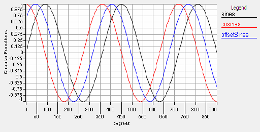
The following program illustrates the operations of the XYGRAPH command with one independent variable (degrees) and three dependent variables (sines, cosines and offsetSines). Cut and paste it into Statistics101's edit window and run it.
'Plot an xygraph of sines and cosines:
INCLUDE "lib/mathConstants.txt"
MULTIPLY 1,180 5 degrees
degrees = 5 * 1,180
radians = degrees * degToRad
sines = SIN(radians)
cosines = COS(radians)
offsetRads = radians + pi / 4
SIN offsetrads offsetSines
XYGRAPH "Circular Functions" degrees sines cosines offsetSines
Here is the output of the above program:
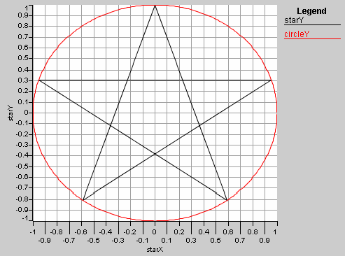
The next program shows the XYGRAPH command graphing two independent graphs. Note the use of the pairs keyword:
INCLUDE "lib/complexCommands.txt"
starAngles = (234 90 306 162 18 234) * degToRad
TORECT 1 starAngles starX starY
circleAngles = 0,361,1 * degToRad
TORECT 1 circleAngles circleX circleY
XYGRAPH pairs starX starY circleX circleY
Here is the result:
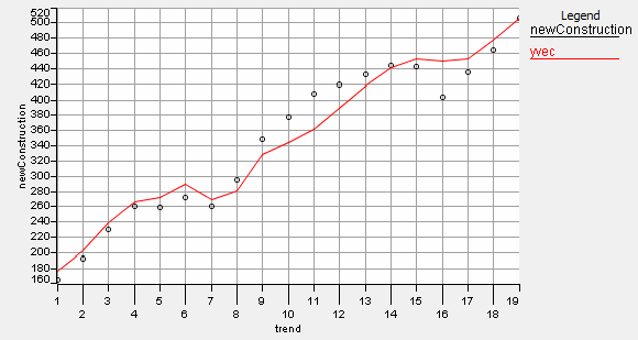
The next program generates a combined scatter and line graph:
INCLUDE "lib/predictCommand.txt"
INCLUDE "lib/mathConstants.txt"
COPY 1,19 trend
COPY 1976,1994 year
COPY (5.04 5.54 7.93 11.19 13.36 16.38 12.26 9.09 10.23 \
  8.10 6.81 6.66 7.57 9.21 8.10 5.69  3.52 3.02 4.21) interestRate
COPY (7.7 7.1 6.1 5.8 7.1 7.6 9.7 9.6 7.5 7.2 7.0 \
  6.2 5.5 5.3 5.5 6.7 7.4 6.8 6.1)  unemploymentRate
COPY (165.4 193.1 230.2 259.8 259.7 272.0 260.6 294.9 \
  348.8 377.4 407.7 419.4 432.3 443.7 442.2 403.4 435.0 \
  464.5 506.9) newConstruction
REGRESS newConstruction trend interestRate unemploymentRate coefficients
PRINT coefficients
PREDICT coefficients yvec trend interestRate unemploymentRate
PRINT table year yvec
scatterCount = 1
XYGRAPH  scatter 1 trend newConstruction yVec
Here is the graph it produces:
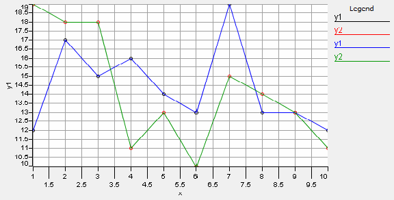
If you want to display a line graph with its data points identified you can duplicate the Y vector with the first Y instance being a scatter graph and the second being a line graph, like this:
SEED 123456
LET x = 1,10  'Make some fake data
SAMPLE 10 10,19 y1
SAMPLE 10 10,19 y2
XYGRAPH scatter 2 x y1 y2 y1 y2